TITLE
"Myths Orientation Series"
2019
WHO
For the International Students & Programs Office🡥 at UC San Diego!
WHAT / WHY
A series of short videos showcasing various myths and misconceptions that are commonly had about the Interntional Student experience at UC San Diego. Used in the International Student Orientation to engage with new students & on Instagram to garner engagement with prospective and current students.
📖 PROCESS
When an International Student comes to the ISPO Orientation,
it's often their first time on campus, maybe even their first
time in the United States. What might be feelings of excitement
is almost immediately met with the first event that all students
are required to sit through: the rules and regulations talk.
A wonderful staff member (Pauline!) had an idea brimming: a
video that would pose a trivia question about rules and prompt
students to raise their hands for yes or no.
THE ASK
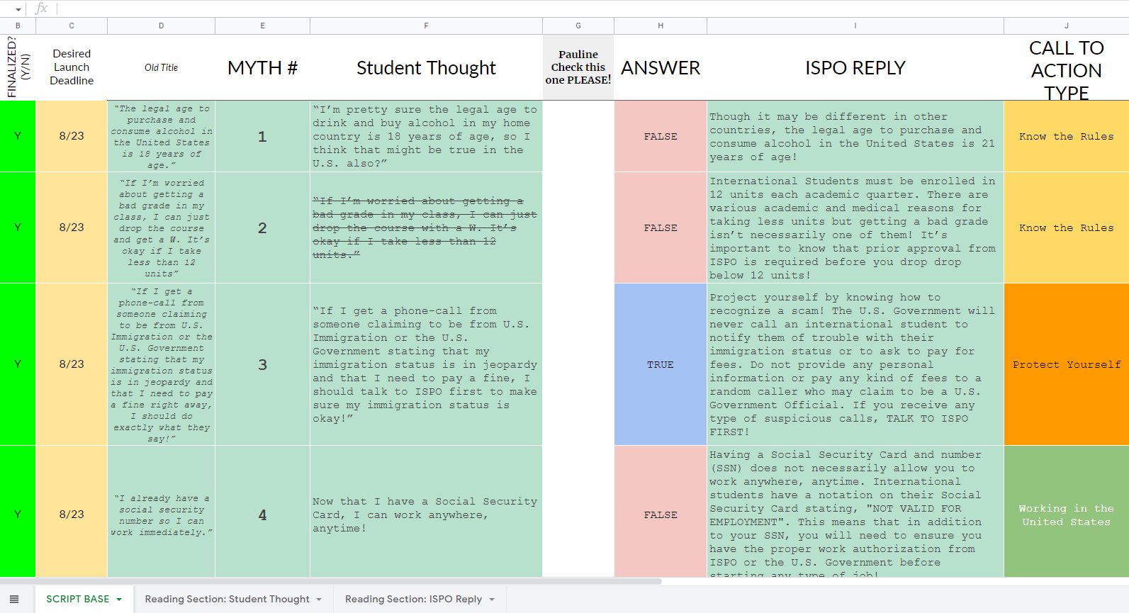
She layed out a series of common myths in writing and passed the torch over to myself and David Yang🡥 to figure out how to execute. She wanted something short—under 30 seconds—and through discussion, something that could be used both in orientation and to promote it on social media.

Master list of videos for the series.
STEP 1: THE MASTER PLAN
We were provided over 16 different myths to do, so we split them
up fairly evenly based upon which ones we felt the strongest
towards.
To tie the series together, I decided to also take responsbility
for all of the motion graphic assets needed, such as an intro,
question cards, true/false card, and others.
A wonderful staff member (Pauline!) had an idea brimming: a
video that would pose a trivia question about rules and prompt
students to raise their hands for yes or no.
STEP 2: THE INTRO MOGRAPH
In generating ideas, I focused around the connotations that the
word "myth" generated: something mysterious, but also of
intrigue. I also considered the feeling of guidance that ISPO
was trying to play to an audience of mostly people new to UC San
Diego.
I played with a design that focused heavily on navigation
iconography and animating it in a lively, yet weight-y way. This
version was ultimately deemed too "heavy," and I went down
another path of something "lighter" and more playful.
The final design brought back solid circles in various shapes
and bright colors. The smaller yellow circle with a horizon line
in the center cyan circle emulated that of a beach scene, but
ultimately sliding off the screen like that of a cartoon toy.
STEP 3: THE VIDEOS
With these shorts, a lot of the ideas came to life visually in
my mind, so it was just a matter of mocking it up so that
everyone on the team would have the same page: a previs.
I created several of these mockups in
Cine Tracer🡥, and then brought them into Premiere to fuse both text and
sample motion graphic elements. These were then brought to
meetings where we collaborate to realize the final product.
STEP 4: MOGRAPH ELEMENTS & DIF. VERSIONS
Since all of the myths were posed as questions, it made it easy to create two versions: one with the answer (true/false) right after, or one with an engagement motion graphic to wait for answers. Following the art style from the intro, it was quick work to find something that suited the text and also added movement to engage.
STEP 5: DELIVERY AND REVIEW
Combined, David and I completed around 14 myth videos, each with orientation and social media versions. To my knowledge, the videos are still used for orientation, even for the online sessions!